
Introduction:
Practical tips for website optimization in today’s digital world require businesses to have a robust online presence, where the function of the website’s user experience is instrumental in defining success. This means that as a starter in a digital marketing career in 2024, entrepreneurs need to learn to optimize the website’s user experience.
What is User Experience?
User experience design is the core of the efficient design and optimization of any digital project or website. Understanding the concept is vital for businesses creating an interesting, easy-to-use, conversion-focused online platform. Here is what any entrepreneur should know about user experience, including what it is and what the most important aspects are:
- The definition of the Site User experience in the context of the website is the impression and emotional reaction of the visitor who uses it. Practical tips for website optimization combine many factors, such as usability, accessibility, performance, and aesthetical and quality design, to ensure interest, retention, conversion, and loyalty.
- Important Factors The primary factors that shape the website user experience are Usability and navigability, Accessibility, Performance Aesthetics and design, Content quality, Navigation interaction, and Personal solutions.
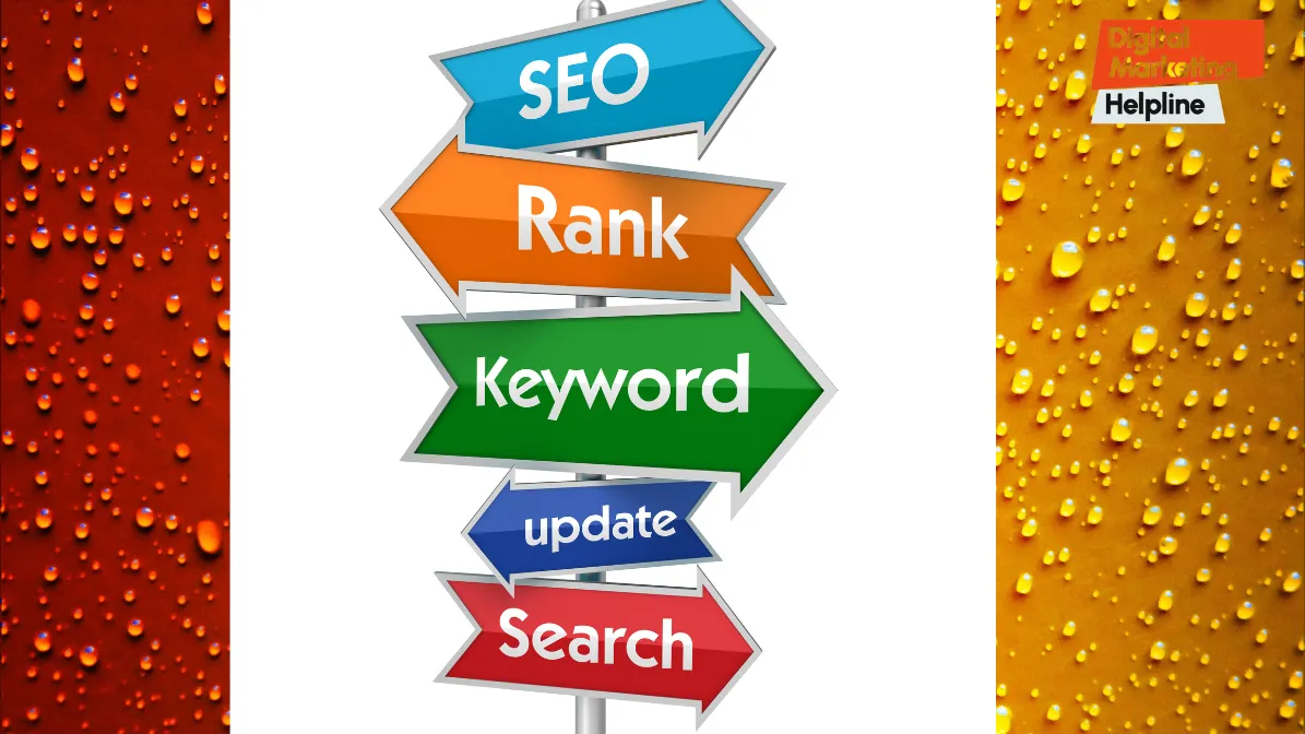
What is Responsive Design for Mobile-Friendly Experience?
Conquering Every Screen: Why Responsive Design is Your Secret Weapon for Mobile Domination?
Websites are no longer designed for heavy desktop monitors. Consumers today are always on the go, attached to their iPhones or iPads. In a mobile-first culture, having a website that can adapt to the changing world would be a significant benefit, which is what responsive design does. It is like the ability of your website to transform into any display, whether it is a widescreen desktop or a pocket phone. Here’s why it’s a game-changer for your business. It should be easy to use. Your potential client will quickly navigate your website on their iPhone but will have difficulty reading the phrases and pressing the buttons. They feel frustrated and immediately hang up – mission accomplished. This is never a problem with design. Responsive design makes everything easy to access and use, no matter what kind of system you have.
Do you understand Responsive design:
Major search engines prioritize mobile-friendly sites in their search engine results pages. It helps increase your chances of cracking the top 10 and being found by your target audience. Responsive design saves you time and resources. You don’t have to make two versions of your site – a responsive website. It’s not a small technicality, but a wise economic strategy for today’s marketer. Ensure your company has switched to responsive design and make it your Smartphone’s golden secret.
Practical Tips for Website Optimization:
Mobile-First Approach: ensure your website is mobile-responsive. Use a mobile-first strategy that enables you to design for smaller devices first and then work your way up to more extensive ones. The following are current strategies and techniques to help you understand how page loading speeds impact user experience and develop approaches to boost your rating stats: With 1 to 10 seconds of load, 123 % of mobile guests are expected to leave this or that site, add Google.
Page loading speed is also a priority aspect of SEO; the fast-moving page is preferable and more acceptable, according to search engines. Annoyed by slow-loading websites, visitors leave, the ratings are lowered, and the pop-ups change to average sales stats.
Tools for measuring and analyzing page loading speed:
Straightforward and Intuitive Navigation: Navigating a website should be a simple and intuitive process that steers a visitor in his or her desired direction with no difficulty. Straightforward navigation is essential for a good first impression, minimal bounce rates, and overall user engagement.
Below are the steps to do straightforward navigation on a website:
Importunate of straightforward navigation in the website: Clear navigation is essential in creating a clear path, enabling the user to navigate to the desired content or an inquiry. It gives users trust and confidence that encourages site exploration, while unclear navigation can be frustrating and lead to high bounce rates. Therefore, it could be a lost opportunity for conversion. By maintaining clear and precise navigation, a business can smoothen its user journey and take the first steps to build trust and confidence.; Best Practices to Organize Website Navigation Menus When designing website navigation menus, different best practices should be considered to make them more accessible and transparent.
The following are the best practices:
Simplify Menu Structure
Group Pages Together
Prioritize Important Pages
Provide Consistent Navigation and
Implement Dropdown Menus Sparingly
High-Quality Content Creation:
High-quality and dynamic content is at the foundation of every successful website with which interacts. High-quality content attracts the site while ensuring it educates, entertains, and inspires users to act. The following is the critical aspect of quality content on a website:
Content quality refers to the content’s relevance, accuracy, clarity, and uniqueness. In simple terms, high-quality content, primarily tailored to the target audience’s needs, is of high quality. Engaging content that is comprehensible to users promotes the website’s popularity and increases consumers’ time spent on it. As a result, users will want to return to the source, leading to fan creation. Besides, quality and unique content are shared through various social media, influencing search engines, ranking useful sites high above search results, and increasing organic traffic. Strategies to Use When Creating Effective Content
Interactive Elements and Personalization:
Know your audience
Generate valuable content
Be consistent
Update your content
Get your audience involved
Interactive Elements and Personalization
Practical tips for website optimization in the digital world are becoming more dynamic daily, and many static websites are losing people’s motivation and interest because static sites are not that useful. To attract and retain many more users to the site, I need to focus on the tool called Interactive Elements and Personalization. The audience can do better and get to the real marketing productivity and high points in the market more promptly and comfortably.

Tool to use in practical tips for Website Optimization:
Everyone should be looking for the advantages of using interactive tools and personalization is the best version for the users and gets everyone the most satisfaction.
All this will attract new users and increase the number of users who have seen my work and want to acknowledge your company by ranking my online business online. That experience will also create a sense of friendliness among the companies in the city that is enjoyable and easy to reach.
Infographics Creation Platforms:
Canva: Canva is a popular graphics design platform with a library of interactive infographic templates and editing tools to help you create visually appealing and engaging content. WooCommerce Product Add-Ons: WooCommerce Product Add-Ons is an extension of the WooCommerce platform that offers your customers product customization and variations that make their orders one-of-a-kind.
Google Maps API: Google Maps API is a platform for integrating Google Maps on your website, which can provide helpful location-based details, directions, and points of interest.
Accessibility for All Users:
Inclusive design is more than a social driver, legal obligation, or marketing ploy. Ensuring your website is accessible to all, including people with disabilities, is a social responsibility. Inclusive design with the ability to reach a broader target group, increase user satisfaction, and boost brand image is a social responsibility. Importance of Accessibility in Website Design Accessibility involves developing and designing websites and digital materials to be perceived, operated, comprehensible, and robust for all consumers, regardless of their abilities or disabilities. By focusing on site accessibility, businesses may do the following: Expand Audience Reach, Enhance User Experience, Adhere to Legal Obligations, and Establish Trust Tools for Testing Website Accessibility. Several instruments can help you examine the accessibility of your website and material. WAVE Web Accessibility Evaluation Tool Axe Accessibility Testing Tools Screen Readers Color Contrast Checkers
A/B Testing and Continuous Improvement with technology constantly evolving, user experience can never be fully optimized in one go. A/B Testing, or split testing, is a robust method to track and analyze two variants over the same period or the whole term to improve their performance. This methodology enables companies to try different design elements, content formats, and functionality to understand which one works better. Consequently, it makes business decisions better grounded than merely trusting intuition while allowing for empirical A/B testing.
This section will examine A/B testing thoroughly and provide realistic examples and implementation strategies.
Overview of A/B Testing and Its Importance for User Experience Optimization:
A/B testing, or split testing, is a methodology that compares two or more versions of a webpage or email to see which one performs better in terms of a specific goal or metric. Businesses can experiment with a change in design or content by directing random contractors to different variants and comparing the approaches. It allows for a more empirical approach to the question, as the decision is based on the actual user response and not the business owner’s guess. Importance of Continuous Improvement Based on User Feedback and Data Is user feedback and analysis completed, and key performance indicators established? Finally, the company must continue collecting and analyzing user feedback, tracking KPIs, and conducting regular A/B testing.
Conclusion:
In the rapidly evolving and competitive world of digital marketing, user experience on websites is not a “nice-to-have,” it’s a “must-have.” As we’ve seen throughout this guide, user experience is a multi-faceted discipline that demands a deep understanding of user behavior, an aggressive commitment to ongoing optimization, and a relentless obsession with delivering value and satisfaction to your Audience.
Many more fun experiences are waiting for you if you make them. For more detailed information about digital marketing or any questions, contact us at Digital Marketing Helpline. Our professional team will assist you in maintaining your journey to lifetime digital marketing.


